Table of Contents
“People ignore design that ignores people.” — Frank Chimero
Let’s start with some facts:
– “…the average app loses 77% of its DAUs (daily active users) within the first 3 days after the install.” – Andrew Chen
– 52% of users claim that a poor mobile experience makes them less likely to engage with a company. – Think With Google
– eCommerce conversion rates for computers are 3.94% while mobile conversion rates are 1.84%. – Smart Insights
– 85% of people want a company’s mobile website to be as good or better than their desktop website
To be honest – the way we use and experience a mobile app is very different from a desktop website. It would be wrong to deny that we use mobile more than we use the desktop. Users are turning to their mobile devices more and more these days and it is completely normal! If one can get access to the digital world in the palm of their hands, then who would not want to have a piece of it!
Difference between Desktop and Mobile UI/UX
For a company, looking to design a website/application for its product/services, the first and foremost point to take into consideration is that web design and mobile app design are not interchangeable. UI/UX changes drastically. Look at this from a user’s perspective. The user wants a unique experience for both mobile and desktop. And this also becomes a deciding factor for the user to consider whether they would continue with the web app or not. Users won’t think twice to delete an app that they don’t find it simple to use.
Design principles for a desktop app are usually slightly different from the most effective mobile UX design conventions. Generally, UI/UX designers fail to take care of the fact that mobile user behavior is different than that of website user behavior. This exactly then becomes the core reason for a user experience compromised web app – be it on a mobile or desktop.
The number of smartphone users worldwide surpasses 3 billion and is forecast to further grow by several hundred million in the next few years. About a decade ago, not many of us gave a thought that the user interface and user experience would play a crucial role in mobile app development. At this point in time, it becomes important for companies to focus to create a better user experience in mobile apps, For which they can seek assistance from the experts. Mobile UI is the first impression of an app. The idea is to simplify the user journey in the app – thereby, connecting the user to the brand, and also increasing the overall app ROI.
What makes a great mobile UI/UX design?
A concern of mobile UI designers is usually how the product looks with the visual elements laid out. For an app to be successful, the goal is to touch the instinctive emotion and positive engagement of the user.
It is said, “A good UI Design is invisible to the user”. A good designer visualizes the UI design that sets a benchmark to improve the brand reputation and status of the company and helps the user to efficiently navigate through the app and figure out the features of the app and options with ease.
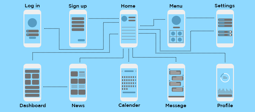
A great mobile app UX design can be determined by the amount of time a user spends on the app to finish a transaction. For example, in an e-commerce app, a user tries to buy something, the amount of time it takes for the user to complete the transaction is what determines how good the UX design is.
But doing proper research is of great significance before the design and development of an app. It takes a great amount of research and comprehensive competitive analysis done by the designer to create an impressive UX design that addresses the way a user feels about the product/service. It understands and reflects the context in which a user engages with an app.
An effective UI/UX structure requires users to stay and help organizations to eventually gain business and a loyal customer base.
The Basic Rules of Designing a Mobile App
Eliminate Clutter
The more time a user wastes to separate the useful information from the chaos on the screen, the less satisfied he is. The first thing a user wants to figure out once the app is downloaded is to understand the app. The lesser time it takes for the user to figure the app at the earliest, the better it is. If your app is cluttered with too much information and content, the user could just get lost in the woods and give up on your app. The crux is to minimize the clutter!
Optimize User Flow
Understanding how users interact with a mobile app is vital for optimization. As designers, we should comprehend the user’s objectives from the perspective of the complete user flow. This acquaintance will lend a hand in identifying the most frequent friction points while managing a task completion.
- If a job comprises of multiple steps and actions are needed from the user’s end, it is better to segregate tasks into the subtasks.
- Use the details smartly that you already have regarding your users so they do not have to feed the details again.
- When the task needs users to finish multiple steps, sustain the momentum by clearly showcasing the next stages.
Rule of Thumb
We find ourselves engaging with mobile apps with one hand with short spans of partial attention in a highly distracting environment. This type of mobile user experience is called “one thumb, one eyeball” experience. The trick to getting the design right is by making sure if users can perform a certain number of tasks with just one hand in under 60 seconds.
Considering this, the space and size of the buttons should be designed with the thought that our thumbs are definitely not like a mouse cursor. users need enough space for tapping or clicking the CTA buttons that is within our reach. This then calls for designing the buttons in the flow of the thumb zone.
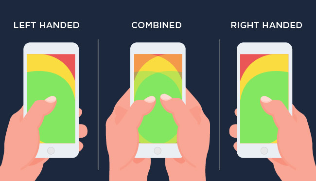
You should place the negative elements in the zone that is under the ‘Hard to reach’ area as you do not want users to accidentally tap on them. also, it should be taken into consideration to place the frequently used controls and common actions under ‘Easy to reach’ area for empowering users in performing tasks with ease.
Affordances & Signifier based design
Affordances are necessary for an intuitive and easy to use a mobile application. While affordance is the function, signifiers hint at affordance. Use signifiers rightly so users don’t need to think about what each interface element does. Affordances are of various types:
Visual Affordance: includes the hints given off by the physical appearance of the object.
Language Affordance: it is the clues are given to a user with words like Click me” or “Go back” buttons.
Pattern Affordance: one of the most widely used affordances; the most commonly used pattern affordances include navigation menus/bars, etc.
Symbolic Affordance: icons are essentially symbolic affordances and are based on real-life objects to convey to users what action they need to perform.
Negative Affordance: The presence of an inactive button, essentially indicates no affordance at all.
One Task One Screen
Space in smartphones is limited. Consider designing for the smallest screen size and, having multiple actions on this screen will be close to the death of your design. It is advisable that every primary screen simplifies to just one key action of real value to the person using it. This practice makes users comfortable and they can easily adapt to your app; this also ends up demanding complete attention to one call to action, simplifying the whole process.
Accessibility and Readability
An app may be used by experts or novices alike, making sure that basic app functionality is accessible to the majority of users. The design should take into account a diverse userbase, including the differently-abled.
- Use simple, unambiguous language, and ensure the app supports local languages
- Prioritize elements that require the user’s focus, such as a CTA
- Use high contrast color combinations for better viewability
- Content should be short and easy to skim
Take Advantage of the Device’s Capabilities
If we consider mobile as a minimized version of a desktop one, certain hindrances limit your opportunities to create a unique and outstanding application. But try to move beyond the “mobile-first” approach and use the perks of a mobile device that a desktop lacks.
Push messages: When relevant personalized information from an app appears as a notification, it becomes hard to miss. Also, it is not a good sign to overdo it.
Geolocation: This helps personalize results displayed on the screen and eliminates the need to input the user’s address manually.
Camera: this helps release users from unnecessary manual data input and opens up new opportunities to implement AR tools, which are gaining in popularity.
Loading
Modern users have become used to applications that load content instantly. If their wait lasts longer than a few seconds, users get impatient and might even quit the app. But sometimes a wait is unavoidable — for example, during the execution of transactions, or when there is low-speed internet. In this case, your goal is to make these miserable seconds less frustrating for the user.
Conclusion
Designers often say that the best designs are invisible. However, users who utilize it, center on their objectives and not on the immersed interface. So, one should go all-out to build smart mobile UI/UX as such; they delight user requirements and deliver better user experiences. If you are looking to create a seamless and amazing mobile app for your product/service, Hire a Mobile App Developer today and fulfill your technology needs with us.






Leave A Comment