Table of Contents
Online searches are the most common way for website visitors to become potential customers.
And with 1.13 billion active websites, you can’t stand out.
A great web design, however, can help your business stand out from the competition. Therefore, staying up-to-date with the latest web design trends is inevitably essential.
Here are the web design trends that will innovatively allow you to stand out from the competition.
Let’s take a look!
Web Design Trends 2024
- Custom Illustrations
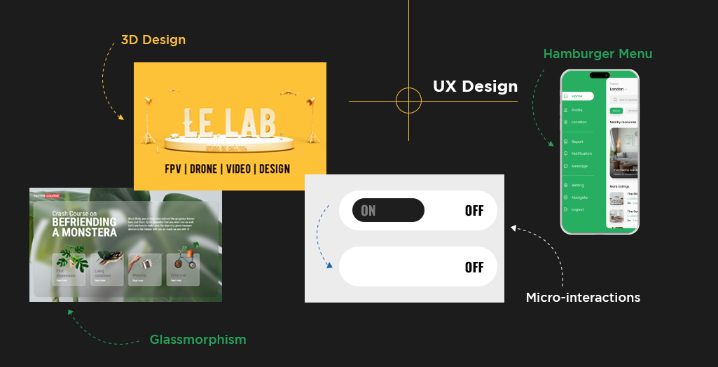
- Interactive 3D Elements
- Micro-Interactions
- CSS Grid
- White Space
- Dark Mode
- Accessibility
- Neomorphic Design
- Organic Shapes
- Fresh Color
- Augmented Reality (AR) Integration
- Nostalgia
- Artificial Intelligence (AI)
- Minimalism
- Complex Gradients
1) Custom Illustrations
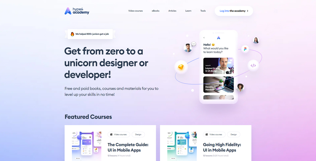
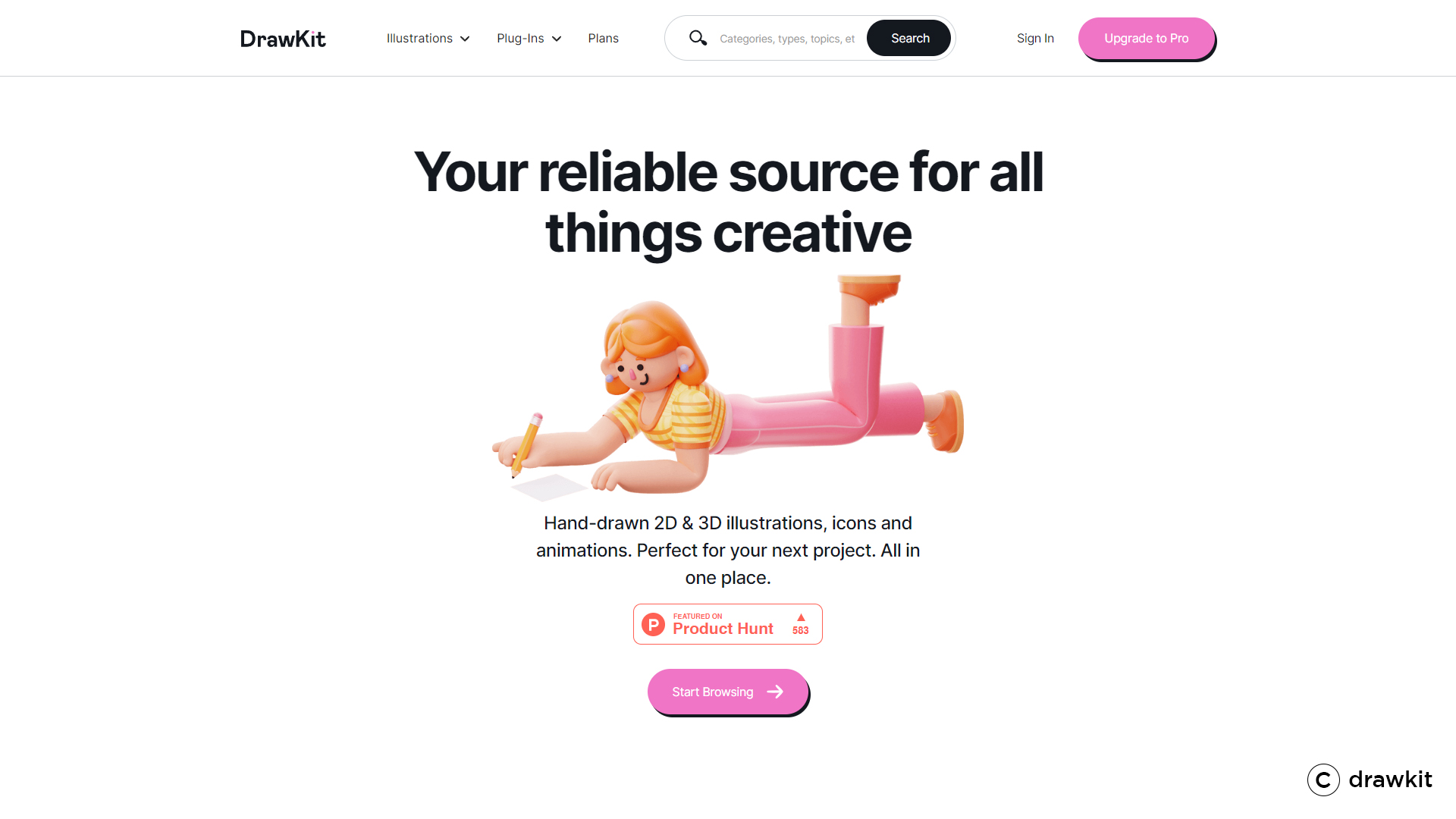
The novelty of custom illustrations makes them easily recognizable. These are specially designed for the brand and can make it instantly recognizable. It can capture your identity and stimulate the essence of your business in a playful, engaging, and exclusive way. The style of custom illustration confirmed from the website theme, which is related to the website idea.
Custom illustrations can also be conceptual designs of UI or brand logos. These can also be used on business letterheads, packaging, and even office stationery.
You can create amazing custom illustrations keeping in mind some motives like,
- Adding a human cast and facial expressions to evoke the feeling associated with your brand.
- Enhancing UX by triggering nostalgia or uplifting deep thoughts.
- Keep it consistent to ingrain it into the psyche and daily lives.
2) Interactive 3D Elements
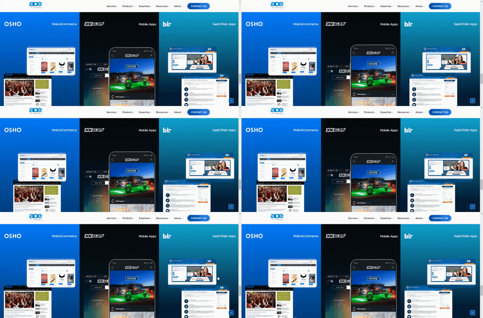
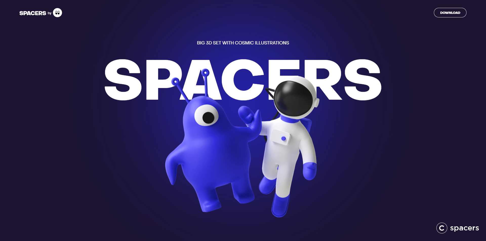
3D technology has become well-established in various divisions like gaming, movies, smartphones, and AR-VR. This technology when considered with web design can do wonders.
When the majority of websites look flat, your website infused with 3D elements can instantly catch the eye. It can also create a more engaging interface with a more elaborate experience (for say, a 360-degree product view).
The interactive 3D design has a lot of practical applications that can provide the viewers with a sense of tactility, deepening their experience with the brand to stay more connected.
Inspiring example:
3) Micro-Interactions
Seth Godin once said, “Every interaction, in any form is branding.” And it is so true with the micro-interactions on your website.
The only purpose for involving micro-interactions in your web design is to create a jiff that engages the ‘human’ user.
To include micro-interactions, you need to consider TrRuFeeL (Trigger, Rule, FeedBack, and Loop). It begins by initiating the micro-interaction that might be user-initiated or system-initiated, followed by ruling the feedback and continued by a loop.
The main benefits collected by a website with micro-interactions are;
- Improved website navigation
- Instant and relevant feedback on the users’ actions
- Escort users’ attention
- Generates a rewarding user experience
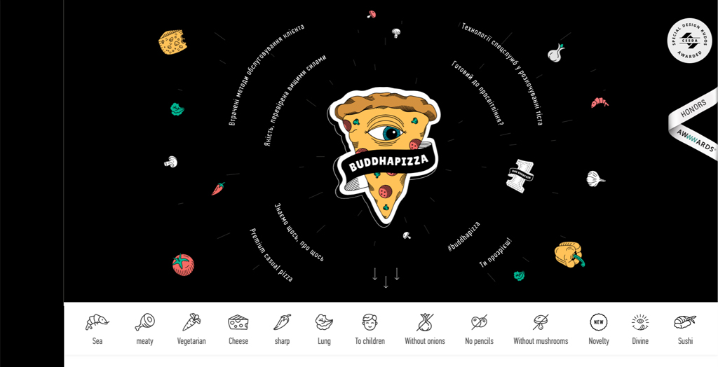
Inspiring example:
4) CSS Grid
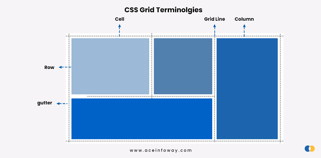
The CSS grid is a layout solution that allows you to control the size and placement of grid items. It provides flexibility in web designing to achieve any layout needed by web designers.
CSS grid works best by diving up the major portions of a page into smaller parts by positioning the correlation between elements concerning size and position.
There are five basic terminologies when you work on a CSS grid; columns, rows, cells, grid lines, and gutter.
Using all these spaces afresh, you can create any imaginative grid without any complicated installs or plugins.
Here is an inspiring example:
5) White Space
White space, also known as breathing space or negative space is much more than the empty space between website elements and content. Considering the white space, it is critically important to design the websites so it balances the page’s design, content, and elements, eventually improving viewers’ perceptible experience.
More of the images and content on the screen generates more stimuli at once. This causes a delay, accurately a negative delay in visitors’ response to your call-to-action buttons. Maintaining a reasonable white space, allows the visitors to take the moment in decision-making.
Along with this, the correct use of fonts and spacing between the words, letters, sentences, and paragraphs, refines the legibility and readability of the content.
Here is an inspiring example:
6) Dark Mode
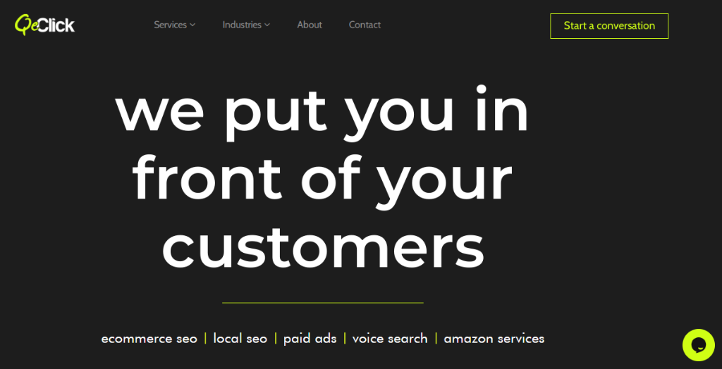
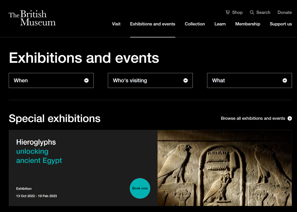
The dark mode is one big trend. You know it when colossal companies like Google, Instagram, Spotify, WeTransfer, MasterClass, and WhatsApp have already embraced this trend.
Black is anything but neutral, and it evokes powerful emotions.
It should be counted in the evolution milestones of better user experience as there are several pragmatic advantages when the viewers are provided with dark mode vs light mode.
It straightforwardly reduces the problems associated with vision and headache for the average viewer who spends about 43% of waking hours on screen per day.
Pro Tip: Design decisions shouldn’t just be based on aesthetics and usability, you have to think about your business needs, too. You may be able to stand out from the crowd in your customers’ browsers if you use a layout that is attractive, light, and airy, compared to the dark mode designs your competitors use.
Example:
7) Accessibility
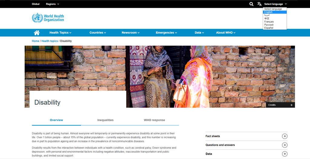
Considering accessibility for web design also means considering over 1 billion people with disabilities to have access to your website.
Accessibility prioritizes building a digital experience that is perceivable, operable, understandable, and robust.
Website accessibility is best achieved when the following characteristics are considered while designing a website.
- Your design is equitable and marketable to people with diverse abilities
- Your design is flexible to attune a broad range of user abilities
- Your design portrays easy understandability, regardless of user experiences
- Your design effectively communicates the necessary information irrespective of different user competencies
WCAG checklist helps you to examine your website for web accessibility standards. Here a good example to demonstrate how to create a simple and better website, which is accessible to everyone.
8) Neomorphic Design
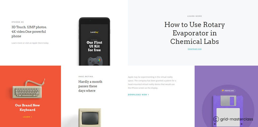
New skeuomorphism is what we understand as neomorphic design. It is the web design that pivots the use of shadows to obtain a floating-like effect of the elements.
While designing a website, neomorphic design is all about elusive contrast and some solid colors created by using shadowing and light.
Here, the peculiarity displayed by neomorphic designs is using the exact same color of the element as well as the background. Here it is mandatory not to consider full black or plain white as you are playing with shadows.
See here how wisely you can utilize neomorphic design:
9) Organic Shapes
Shapes are powerful elements in web design that thrive in building visual identity. Of all others, organic shapes grow a sense of deep connection to the world around us, as it is all about using natural and substantial elements to invoke the perception of being plunged into nature.
Organic shapes contrast with precise geometric lines that illustrate the sense of synthetic and technological elements. However, organic designs use voluptuous imperfect linework to represent more natural and organic forms.
These comprise shapes that include nature shapes like flowers, leaves, butterflies, and clouds, etc. with irregularity to define comfort, unification, and approachability. Some designers even use organic shapes to make the website look more stylish and contemporary.
Some omnific examples:
10) Fresh Color
Color is one of the most powerful tools for any design. The color we see in our daily life can be divided into various categories, like warm, cool or neutral. Fresh colors are the ones that are usually refreshing in essence. When applied, these colors create a bright, vivacious, and inviting impression on the viewers.
Why is color such a powerful force in our lives?
What effects can it have on our bodies and minds? Or How colors can affect you?
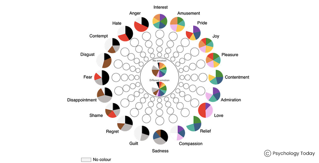
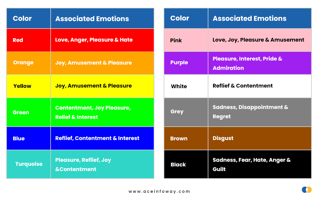
We need to understand the emotions associated with each color in order to understand the impact of colors on human mind and body. The below charts will help you understand the colors and emotion association and then you can easily relate how you can utilize a proper color pattern for your business identity.
The usage of fresh colors generate a notion of fun and can immediately enhance viewers’ moods. Hence, for any website design consider color psychology to derive a color palate for the look and appeal to the users. The colors you select for your website can be vivid and fresh, sepia or prismatic, but they should never be haphazard.
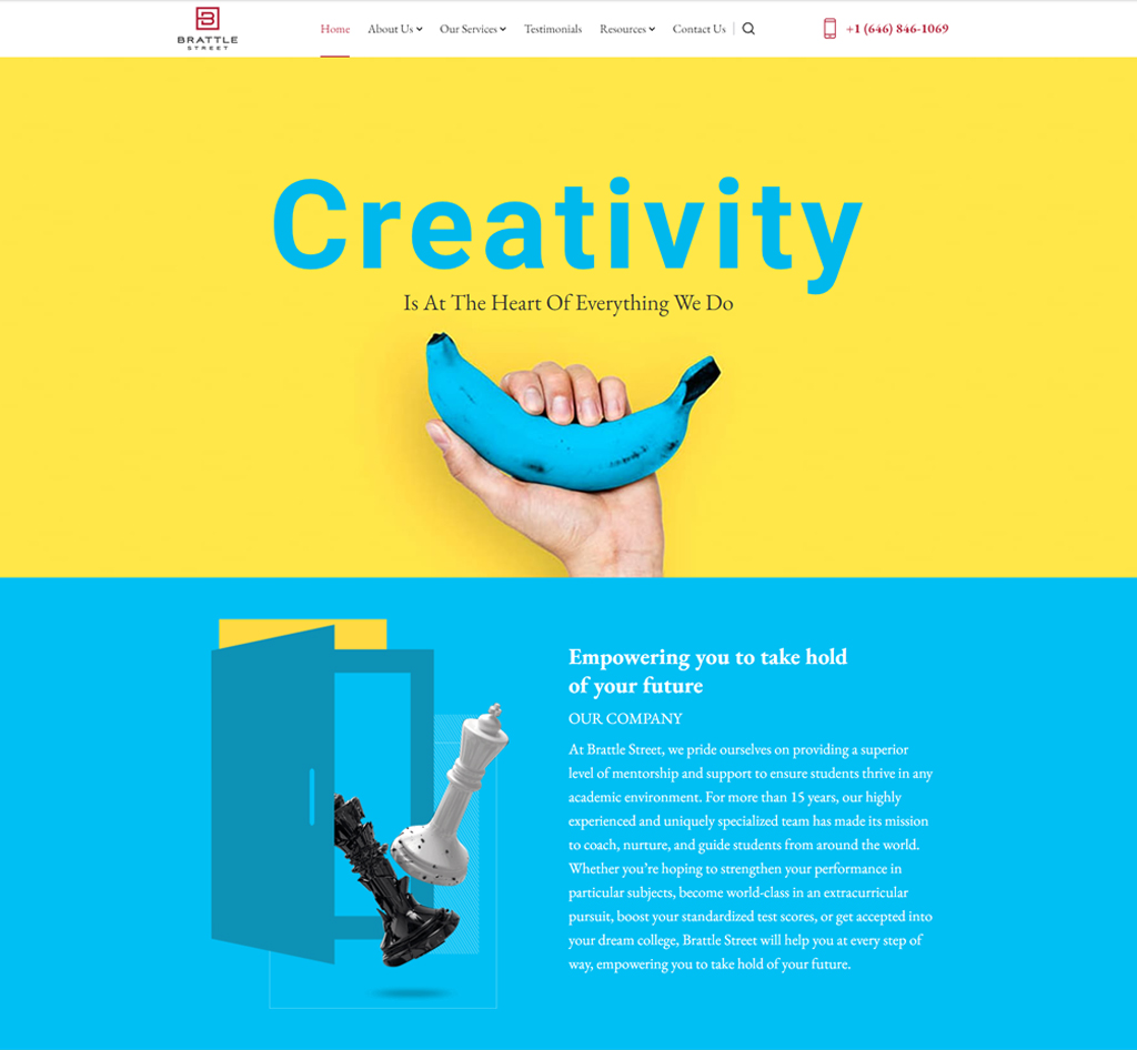
Here, take a look at some fresh color combinations:
11) Augmented Reality (AR) Integration
Have you ever wished that shopping online could be more realistic than trying things on?
AR overlays add a new dimension to your online space. Imagine scrolling through a story where you can virtually try on shoes or rearrange furniture with just a tap. AR Integration takes your ordinary online journey and makes it extraordinary.
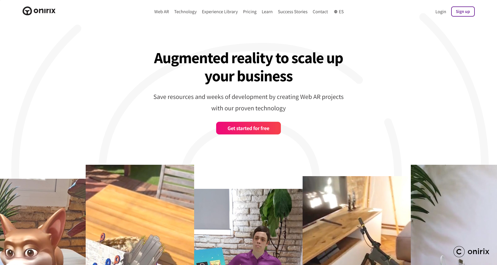
Augmented Reality (AR) Integration is like giving your online shopping a tech upgrade. It’s not about fairy tales; it’s about making your online experience more exciting.
With AR, web design has become more than pixels and code – it’s about creating a captivating experience. Step into a future where your online world is as engaging as magic. Get ready for a web design journey with a touch of AR magic!
12) Nostalgia
Nostalgia in web design isn’t just a trend; it’s like flipping through a photo album of memories! Imagine web designers as storytellers, adding a touch of the past with vintage colors, fonts that remind you of grandma’s recipes, and classic designs that make you go, “Oh, I remember that!”
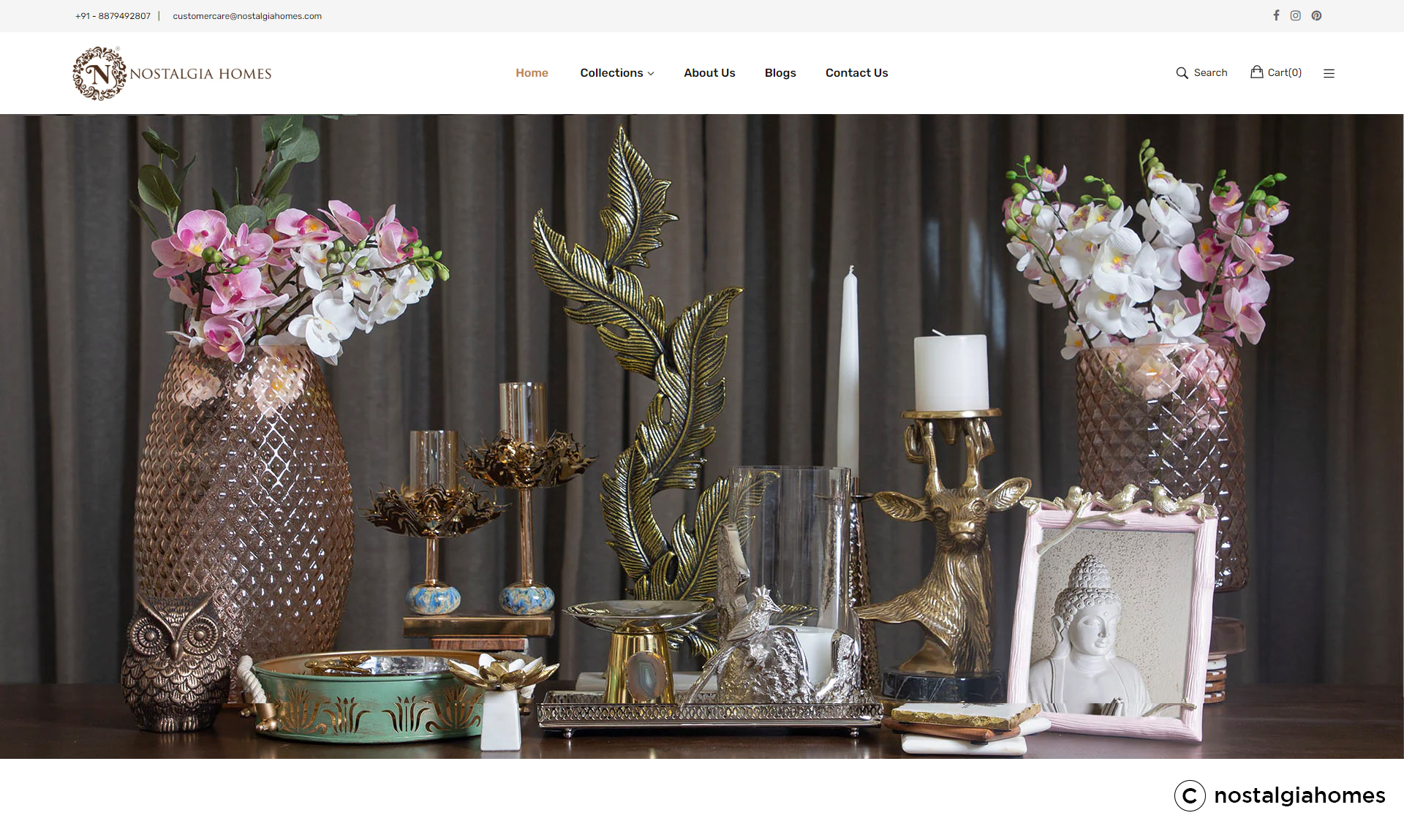
It’s more than a throwback look; it’s like a comforting embrace of familiarity. These nostalgic design elements aren’t just pixels; they’re like little reminders, sparking feelings of joy and nostalgia, much like finding your favorite childhood toy in the attic.
And guess what? Brands are joining in on this nostalgic journey too! For them, it’s about creating stories that connect with users’ memories. Nostalgia isn’t just a design trend; it’s your digital time machine, turning your online experience into a stroll down memory lane. Get ready for a web design adventure – Nostalgia style!
13) Artificial Intelligence (AI)
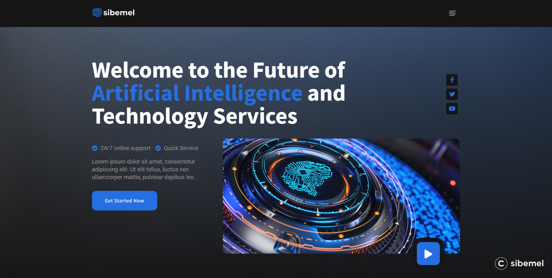
Imagine having a digital superhero in the world of web design, like a tech-savvy sidekick. Picture AI as your digital buddy, studying what you do, and creating a personalized journey just for you. By recommending products that resonate as if plucked from your wishlist and tailoring website interfaces according to your preferences, AI emerges as the ultimate ally in web personalization. It’s akin to having a website that understands you even more intimately than your closest friend.
So, say goodbye to boring online experiences, and welcome to the new era where your website is your personalized playground. AI isn’t just a trend; it’s a digital upgrade, making web interactions as smooth as a superhero landing.
14) Minimalism
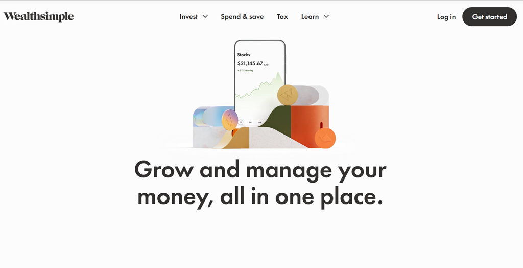
In a virtual world often filled with too much stuff, Minimalism steps in like a guide, cutting through the mess and creating a calm, digital masterpiece.
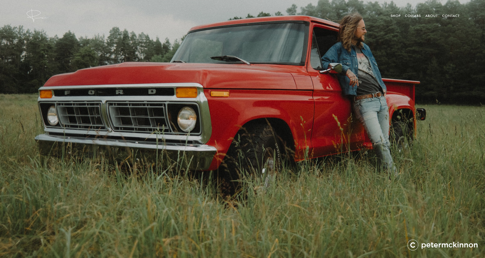
Minimalist design isn’t just about looks; it’s like rearranging furniture to make your journey easy and stress-free. It’s like turning your digital space into a peaceful spot amid the online hustle.
Navigate through a website that’s well-organized and easy to understand. Minimalist design isn’t just about aesthetics; it’s about decluttering, making your online journey stress-free. It’s about creating a digital space that’s simple and user-friendly.
15) Complex Gradients
Now that we’ve uncovered the best web design trends, let’s dive into the vibrant world of Complex Gradients – the party animals of color sophistication!
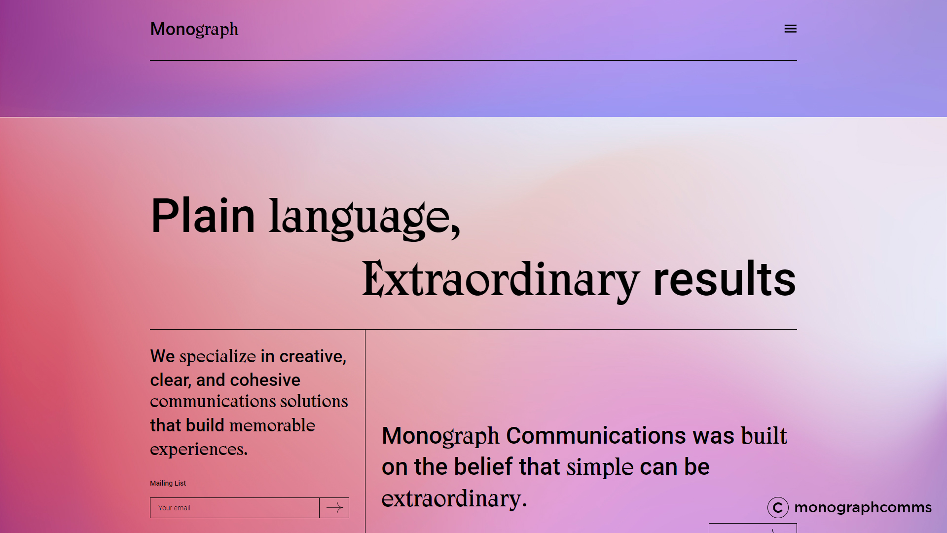
Say goodbye to those plain, boring colors. Complex Gradients are here to bring some excitement. Imagine designers as the DJs of colors, creating blends that work together smoothly. They can go for a calm, one-color look or amp it up with a mix shades – like a fun dance party on your screen!
But it’s not just about looking cool. Complex Gradients are like the confetti of web design, making your online journey not just fun but also super memorable.
Wrap up
The design of your brand acts as a silent ambassador.
The custom website design industry is growing continuously and so are the competition and user expectations. Thus for any business, to increase brand awareness, connect with customers and magnify sales it is inevitably important to stay up-to-date with the ongoing trends in web design. Here is how the use of eminent design web design can affect your business:
👍 It establishes a solid foundation of originality and eloquent harmony
👍 It creates visual triggers
👍 It quickly transfers the message
👍 It is an effective way of story-telling
👍 It sets up an emotional appeal
👍 It makes interactions simple and faster
Moreover, web development agencies in 2023 have to deliver an interactive, personalized and engaging user experience.
Ace Infoway is designing websites for more than two decades now and has obtained a good grip over utilizing the best trends for your next web designing project work. Feel free to connect with us now!


