Table of Contents
A staggering 94% of users cite poor design as the reason they mistrust or abandon a website or application. In a world where users are spoiled for choices, businesses cannot afford to overlook the significance of UI design in forging connections, building loyalty, and ultimately driving business success. For this reason, User Interface (UI) design, with its ability to shape the visual and interactive aspects of digital interfaces, holds the key to captivating users and keeping them hooked. So here are the fundamental principles of UI design that hold the potential to transform ordinary interactions into captivating experiences that leave customers spellbound.
Let’s explore!
7 UI Design Principles
- Clear and intuitive navigation
- Consistent Visual Design
- Responsive and Adaptive Design
- Streamlined User Flows
- Effective Use of Calls-to-Action (CTAs)
- Involve everyone by contemplating Accessibility
- Feedback and User Interaction
1) Clear and intuitive navigation
When users land on a website or application, they expect to navigate effortlessly and find what they are looking for without frustration. In fact, studies reveal that 76% of consumers consider ease of navigation as the most important factor when it comes to website usability. A survey conducted by Clutch revealed that 94% of users stated that easy navigation is the most important website feature. Furthermore, 38% of users will stop engaging with a website if they find the layout or content structure unattractive. When users can effortlessly navigate through a website or application, they are more likely to stay longer, explore more content, and ultimately achieve their desired goals.
Remember these tips:
- Avoid cluttering the navigation menu with too many options.
- Opt for clear and concise labels that accurately represent the content or section users will find when clicking on them.
- Place the most important and frequently accessed sections prominently in the main navigation menu.
- Ensure consistent navigation placement and style across all pages of the website or application for familiarity and ease of use.
- Organize menu items in a logical and hierarchical order, with broader categories at the top and subcategories underneath.
- Incorporate a search bar within the navigation menu for users who prefer searching for specific content.
- Design navigation menus that adapt seamlessly to different screen sizes and devices, providing a consistent experience for all users.
- Use visual indicators such as highlighting or underlining to signify the currently active page or selected menu item.
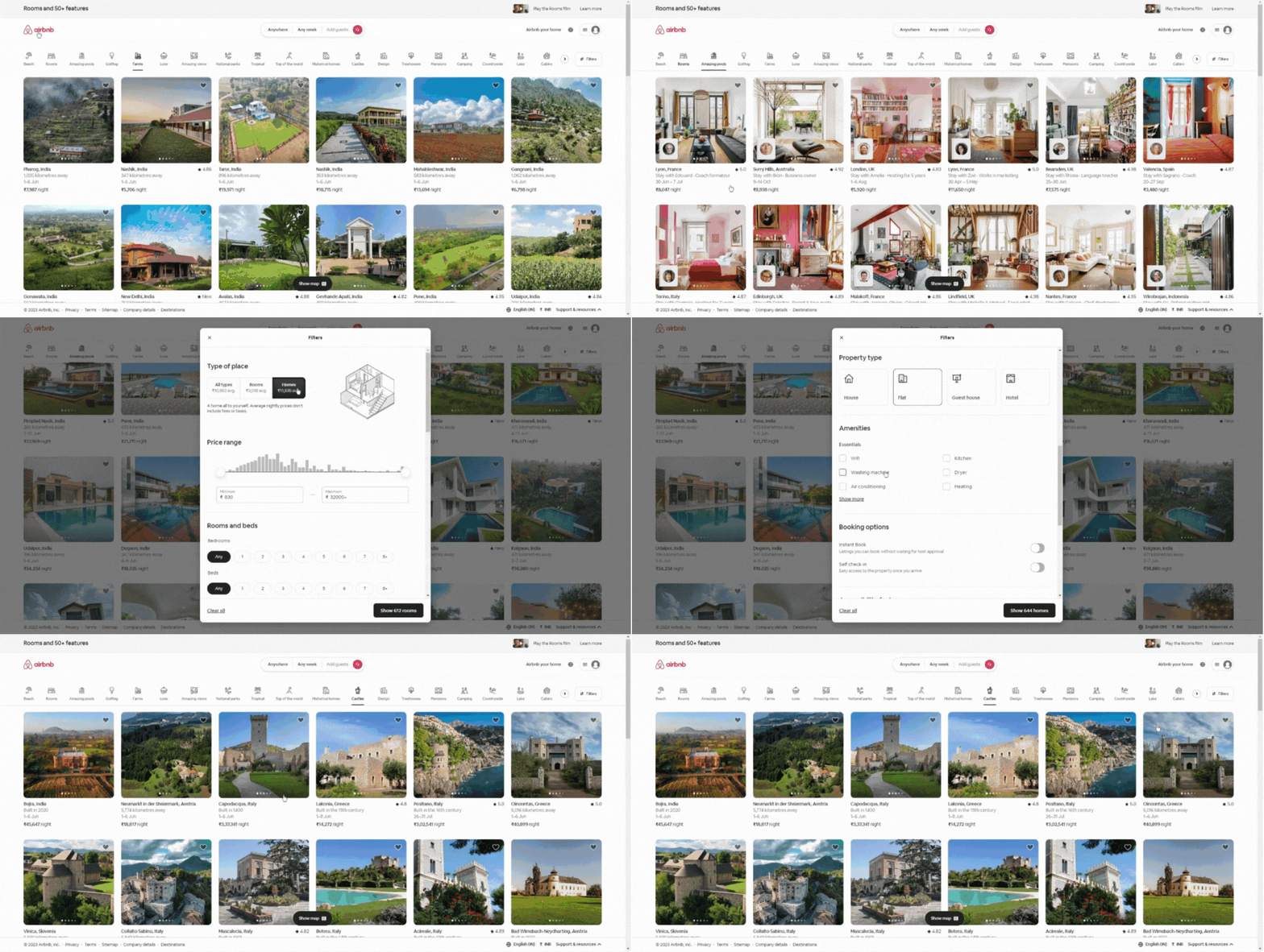
One notable example of streamlined navigation can be seen on the website of Airbnb:
2) Consistent Visual Design
Consistency in visual design elements helps establish a sense of familiarity, professionalism, and trust, leading to improved engagement and user satisfaction. It not only enhances the user experience but also positively impacts brand perception. Moreover, it helps users navigate with ease, reduces cognitive load, and fosters a sense of trust and professionalism. When users encounter a visually consistent interface, they are more likely to stay engaged, explore further, and form a stronger connection with the brand.
Remember these tips:
- Ensure that the visual design aligns with the overall brand identity, including the brand colors, logo, and tone of voice.
- Implement a grid system to maintain consistent alignment and spacing across different pages and components.
- Define a consistent color palette and use it consistently throughout the interface to create a cohesive visual experience.
- Select a set of fonts and typography styles that reflect the brand personality and use them consistently across all text elements.
- Develop reusable UI components to maintain consistency and efficiency when designing and implementing new elements.
- Maintain consistent spacing between elements and ensure proper alignment for a visually pleasing and organized layout.
- Use a consistent set of icons throughout the interface, adhering to a unified style and visual language.
- Ensure visual consistency across various devices and platforms, including desktop, mobile, and different browsers.
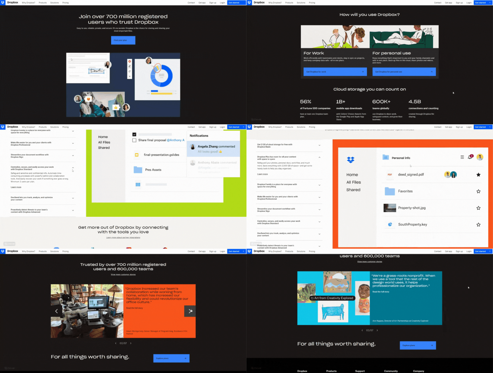
A noteworthy example of consistent visual design is seen on the website of Dropbox.
3) Responsive and Adaptive Design
With the proliferation of devices and screen sizes, it has become essential for websites and applications to seamlessly adapt to different platforms and provide a consistent user experience. Responsive design ensures that the layout and content dynamically adjust based on the device’s screen size, while adaptive design tailors the UI specifically for each device. This is seen in a study by Adobe that revealed 73% of consumers prefer engaging with websites that provide a consistent experience across devices. By providing a consistent user experience across platforms, businesses can reduce bounce rates, increase time spent on the site, and improve conversion rates.
Consider these practical tips:
- Begin the design process by focusing on the mobile experience, ensuring a solid foundation for responsiveness.
- Leverage responsive frameworks like Bootstrap or Foundation to streamline the development process and ensure compatibility across devices.
- Design with a content-first mindset, organizing content in a hierarchy that adapts gracefully to different screen sizes.
- Use fluid grids and relative units (such as percentages) to create flexible layouts that adapt to varying screen sizes.
- Compress and resize images appropriately for different devices to reduce load times and improve performance.
- Implement CSS media queries to apply specific styles and layout adjustments based on different screen sizes and resolutions.
- Thoroughly test the design on various devices and screen sizes to ensure a consistent and optimized user experience.
- Optimize interactive elements for touch input, ensuring they are easily accessible and responsive on mobile devices.
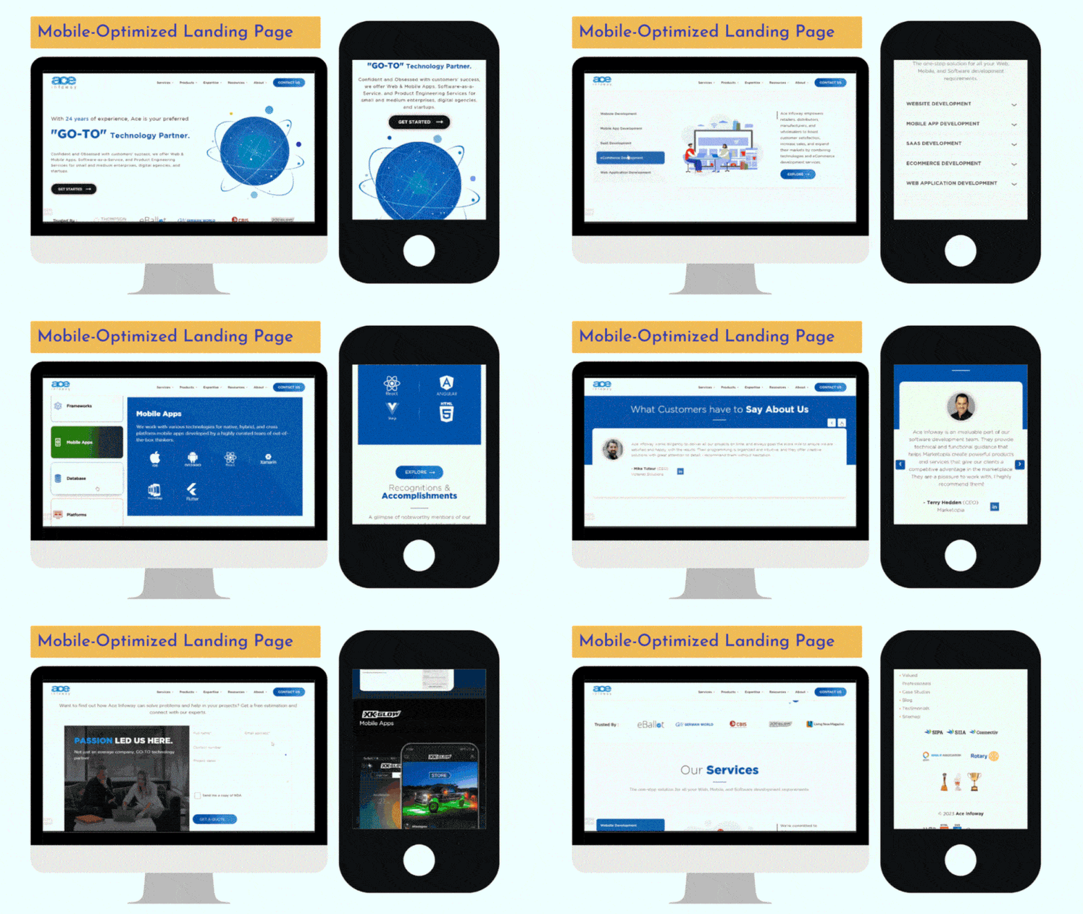
Here is a brilliant example of Ace Infoway’s website that showcases responsive and adaptive design:
4) Streamlined User Flows
User flow refers to the sequence of steps a user takes while navigating through a website or application to accomplish a specific task or reach a desired goal. When the user flow is well-designed and streamlined, it guides users smoothly and intuitively, resulting in improved engagement and a positive user experience. According to a study by Forrester Research, 50% of potential sales are lost when users struggle with the user flow or encounter a complex checkout process. Additionally, a report by Baymard Institute reveals that a user-friendly checkout flow can significantly reduce cart abandonment rates, with an average potential improvement of 35.26%.
Use these practical tips to have a streamlined user flow on your website:
- Create a clear and intuitive navigation structure that allows users to easily find the information or features they need.
- Reduce the number of steps required to complete tasks or reach desired outcomes.
- Use visual cues, such as progress indicators and notifications, to guide users through each step of the user flow and provide feedback on their actions.
- Simplify form fields, minimize mandatory requirements, and use inline validation to make the form-filling process smooth and efficient.
- Utilize user data to personalize the user flow and provide relevant recommendations or suggestions.
- Implement a search feature that allows users to quickly find specific content or products.
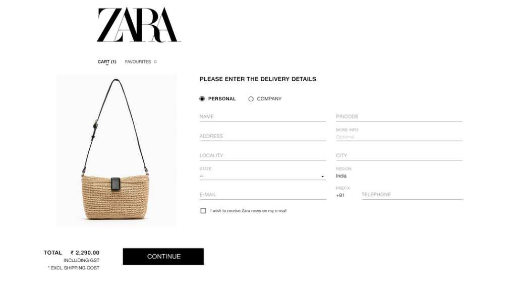
See how easy Zara has made it for their customers to check out their product:
5) Effective Use of Calls-to-Action (CTAs)
CTAs are strategically placed elements that prompt users to take specific actions, such as making a purchase, signing up for a newsletter, or exploring additional content. When CTAs are well-designed and strategically implemented, they can significantly impact user behavior, increase conversions, and enhance overall engagement. According to a study by SmallBizGenius, personalized CTAs convert 202% better than basic CTAs. Additionally, a report by Unbounce reveals that using a single CTA instead of multiple options can increase conversions by 371%.
Consider these best practices to optimize and effectively use CTAs for customer improvement:
- Use color, size, and placement to make CTAs stand out from other elements on the page.
- Create persuasive and concise copy that clearly communicates the value proposition and encourages users to take action.
- Position CTAs where users are likely to see them, such as near relevant content or at the end of a persuasive message.
- Surround CTAs with ample whitespace to draw attention and minimize distractions.
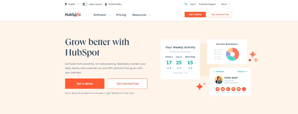
This is one example of HubSpot that wisely invites visitors to access their valuable resource:
6) Involve everyone by contemplating Accessibility
Ensuring accessibility is not only a legal and ethical requirement but also a business imperative, as it allows businesses to reach a larger audience and avoid potential legal issues. When UI designs are accessible, they not only cater to a wider audience but also enhance the overall user experience for everyone. According to the World Health Organization, over 1 billion people globally live with some form of disability. Additionally, a WebAIM analysis of one million homepages revealed that 98.1% of websites had at least one detectable WCAG (Web Content Accessibility Guidelines) failure.
Here are the best practices to ensure accessibility in UI design:
- Follow established guidelines such as WCAG to ensure compliance with accessibility standards.
- Use descriptive alternative text for images to ensure users with visual impairments can understand the context.
- Structure the content using proper HTML tags to assist users who rely on screen readers and assistive technologies
- Ensure all interactive elements can be accessed and used with a keyboard alone, without relying on mouse interactions.
- Use color combinations that meet accessibility guidelines to ensure readability for users with visual impairments.
- Include transcripts for audio content and captions for videos to make them accessible for users with hearing impairments.
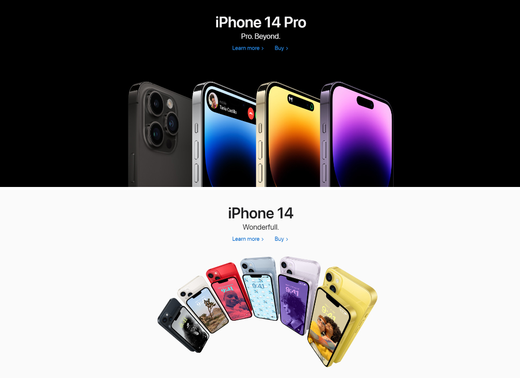
Here is an exemplary website of Apple that showcases the right use of accessibility features in UI design:
7) Feedback and User Interaction
Effective feedback mechanisms not only enhance user experience but also foster trust, confidence, and active engagement with the interface. It involves providing users with timely and relevant feedback in response to their actions, ensuring that they understand the system’s status, progress, and any potential errors or successes. According to a study by Nielsen Norman Group, websites with better error prevention and clear error messages have a higher user success rate, with a 20% decrease in errors and a 22% increase in task completion rates. Additionally, research from Forrester reveals that 66% of online consumers value websites that provide real-time notifications and feedback.
Here are the practical tips to optimize the feedback mechanism in UI design:
- Offer real-time responses to user actions, reducing uncertainty and creating a sense of control.
- Deliver feedback messages that are easy to understand, informative, and specific to the user’s action.
- Incorporate visual indicators, such as progress bars, loading animations, or checkmarks, to communicate system status or completion.
- Consider auditory and haptic feedback options, ensuring accessibility for users with visual impairments or diverse needs.
- Conduct user testing to evaluate the effectiveness of feedback mechanisms and refine them based on user feedback and behavior.
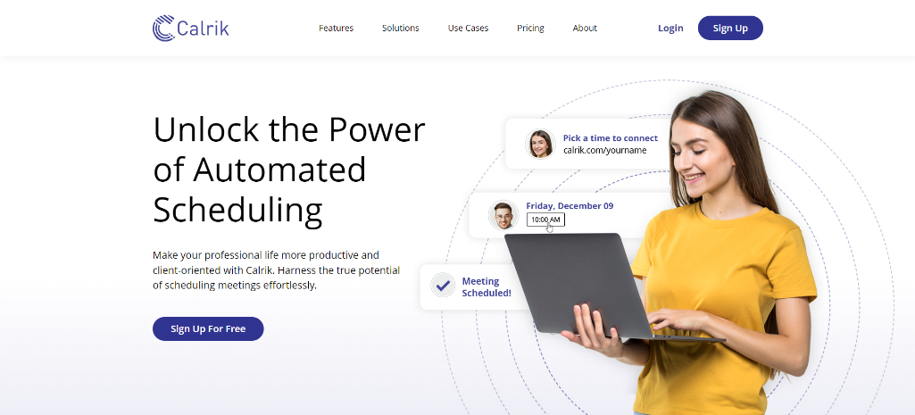
Here is one brilliant example of the utilization of a feedback mechanism as real-time scheduling in UI design by Calrik:
Wrap-Up
Effective UI designing makes all the difference in creating a captivating experience for your customers! Following the principles prescribed here will resonate with your audience to captivate and engage them like never before. Now, it’s your turn to take center stage. Implementing these fundamental principles in your UI design strategies. Take the first step and reach out to our expert UI designers today. Let us help you transform your vision into a captivating symphony of user engagement. Call us today to elevate your UI design strategy and create captivating user experiences!


