Table of Contents
Looking to re-use the components of one project to another, without agonizing over internal dependencies?
Being a programmer, you are aware of the advantages of the component re-use, but the challenges faced during the process especially in the UI components, such as inter-dependency between the modules, code sharing within large teams, accurate documentation, etc, cannot be denied either.
Think of a situation – how convenient it could be to create your components autonomously, which can be accessed and understood by your team easily. The Storybook proves to be a great solution here, facilitating you to create independent modules, so that it can be shared and reused conveniently.
What is a Storybook?
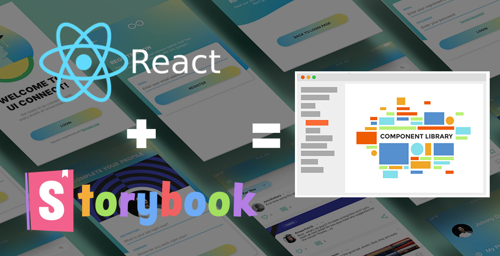
Storybook, a UI component development tool, is used to create “bulletproof UI components” for React, Angular, and Vue. The motive behind the creation of Storybook is to bridge the gap between the designing and development of a component, promoting the incremental approach in Software development. With Storybook, you can create the components independently, check its view and assess its states, in an isolated environment, i.e., you need not create the container program to test the performance of the component instead you can do it in the Storybook itself.
How to start with Storybook to create your React Component Library?
The Storybook runs along your development mode side by side. To start with the Storybook for React component library, first and foremost, you need to create a build system by using the Create React App tool, which takes care of the configurations and tools required for your project. Once the App is created, enable the Storybook to create components and Jest Testing to test them.
Syntax to create a React App :
npx create-react-app name_of_app

cd name_of_app
Syntax to setup Storybook for React App :
npx -p @storybook/cli sb initSyntax to start your React Storybook:
yarn storybookThis command creates a local server on port 9009, with the dashboard of the Storybook, where you can create, delete and test your components.
Creating React JS Components on the Storybook
React JS is one of the most preferred JavaScript libraries for front end development. You can incorporate Storybook to build your React project, and leverage its power into
the development cycle. To create a React component in the Storybook to build your React Component Library, define the title as well as the structure of the component, describing its name and states respectively.
Let’s say if you create a component named DocList, following steps should be followed-
- List down the actions-based categories, such as in this case it can be checked and pinned DocList.
Creating Stories of the ComponentStories, the basic building blocks of the Storybook, are the functions that represent the visual state of the component. Storybook not only maintains the component library, placing all the components in one place(localhost) but also works as a visual guide for the team members, tracking all the changes in place.
Component- Story 1
- Story 2
- Story 3
Syntax to define the component :
import React from 'react';

export default function DocList({ DocList: { title, state }, onArchiveDocList, onPinDocList }) {

return (

<div className="list-item">

<input type="text" value={title} readOnly={true} />

</div>

);

}
- Frame the test states according to the actions performed at each level.
Syntax to define the test states :
// src/components/DocList.stories.js//import React from 'react';
import { action } from '@storybook/addon-actions';
import DocList from './DocList';export default {
component: DocList,
title: 'DocList',
};export const DocListData = {
title: 'Test DocList',
state: 'DOCLIST_INBOX',
updatedAt: new Date(2019, 0,2, 8, 0),
};export const actionsData = {
onPinDocList: action('onPinDocList'),
onArchiveDocList: action('onArchiveDocList'),
};//action() permits to create a callback in the actions panel when clicked.export const Default = () => <DocList doclist={{ ...doclistData }} {...actionsData} />;// actionsData- A React prop to bundle a set of frequently used actions.export const Pinned = () => (
<DocList doclist={{ ...doclistData, state: 'DOCLIST_PINNED' }} {...actionsData} />
);export const Archived = () => <DocList doclist={{ ...doclistData, state: 'DOCLIST_ARCHIVED' }} {...actionsData} />; - Check the Storybook configurations and create the component with mock data.
Mock data liberates you from the dependency of your component on the container class, empowering you to run it in isolation, using the addons like storybook-addon-mock.Syntax to change the configuration file :// .storybook/main.jsmodule.exports = {
stories: ['../src/components/**/*.stories.js'],
addons: ['@storybook/preset-create-react-app','@storybook/addon-actions', '@storybook/addon-links'], };ow, you can restart the server and preview the changes on the dashboard.
- Component Testing
You can test the component in three ways:- Unit Test- Checks the output of the unit on a specific input.
- Visual Test- Done manually by the Developers to check the presentation of the component
- Snapshot Test- Component’s design is compared with the snapshot of the component’s previous design for making effective changes.
- Once the Storybook is set up, the styling and testing are done, you can proceed with the HTML part for designing the component, followed by defining the data requirement and the structure of data that should be enforced to interact with the component.
Syntax to define the structure of the Data :import React from 'react';
import PropTypes from 'prop-types';export default function DocList({ doclist: { title, state }, onArchiveDocList, onPinDocList })
{// code for the export function}DocList .propTypes = {
doclist: PropTypes.shape({
title: PropTypes.string.isRequired,
state: PropTypes.string.isRequired,
}),
onArchiveDocList: PropTypes.func,
onPinDocList: PropTypes.func,
};
So, with this, your component is built and is ready to use. Storybook also allows you to grow your React Component Library by creating a number of components, modify your component by adding states, altering the design, etc. as per the requirement.
Storybook Addons
There are numerous Storybook addons that you can use to enhance your component’s functionality. With the Storybook addons, you can automatically take Storyshots,
change the background settings of the component, link different stories together, check web accessibility, change the version of the build system, etc.
Syntax to include addons :
yarn add -D @storybook/addon-actions // Actions is an addon.Conclusion
Storybook, a revolutionary living style guide, works wonders for the Software Development Team, especially in the case of large-scale projects. To create an efficient project, it requires proper coordination among the team members in order to follow the same standards within the code such as the nomenclature of the objects and variables, etc.
Storybook not only liberates you from unnecessary confusion but also enhances the quality of the project and improves productivity. If you are also planning to create your React Storybook as well as a project, hire a React Developer. For any further related queries, Get In Touch with us.


