Table of Contents
Did you know? Whirlpool increased its profits by $3.7 million by redesigning its website. – Gartner
Website design can make or break your brand. How your audience perceives your brand depends greatly on how your website is designed. It is up to you whether to make an impression and persuade them to remain on your page and learn about your business or to leave and visit a competitor’s. An effective design keeps prospective customers on your page and interested in what you offer. So, to remain at the top of your game, you should always be prepared to evolve.
Evolution helps you stay relevant in the ever-changing world, and the big brands are very well aware of this. Hence, they keep on evolving their product, services, process, as well as website. If you consider the websites of top brands like Facebook, Google, Microsoft, Twitter, and Adobe, none of their websites is the same as they started. With the advancement of technology as well as changing user preferences, the brands redesigned their website to fit in well.
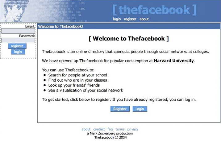
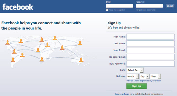
Take Facebook as an example. Here is the comparison of the Facebook website design in 2014 versus now i.e. 2021.
| Facebook website design in 2014 | Facebook website design in 2021 |
 |
 |
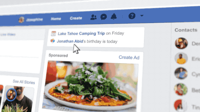
Source: Engadget
Can you see the transformation? Isn’t it fascinating?
The performance of the existing Facebook websites began to deteriorate with the advancement of technology. As Tom Occhino (Engineering Manager at Facebook) points out, the website became quite slow and cluttered from a user-experience standpoint. Additionally, he said the old Facebook website, which was intended for old content and functionalities, had no compatibility with how people are using their computers nowadays.
To address this issue and improve the user experience, Facebook redesigned its website in 2018, and they haven’t looked back since. Users flock to Facebook more than any other social media platform. In fact, as per the latest Statista report, it has more than 2.85 billion monthly active users and is the first social network to reach the milestone of 1 billion registered accounts.
Whirlpool also redesigned its website after realizing that it was unable to serve its customers. In fact, according to a study conducted by Whirlpool, only 11% of consumers were able to conveniently find all the information they required, affecting conversion costs. Basically, this is by far the biggest problem which is faced by most customers, and website redesign is the ultimate answer to it.
How Redesign Can Benefit Your Business?
There are numerous reasons why you might want to redesign your website. Perhaps it looks outdated and you feel it’s time for a change, or maybe you have stagnant traffic and low conversions and want to raise the conversion rate. No matter what the cause is, website redesigning, if done right, can benefit your business in numerous ways-
- Boost your website’s traffic.
- Higher lead conversion.
- Enhance your website’s functionality.
- Optimize your SEO and website performance.
- Improve the user experience.
- Increase brand awareness.
- Improved security.
As you’re here, you’re probably in the middle of a website redesign, or are at least considering it, and would like to consider what is the best process for redesigning your website. In this article, we have shared some of the highly effective tips that should be considered while a customer-centric website redesign.
6 Proven Tips to Redesign your Website to Drive Customer Conversion
According to Jane-Anne Mennella, Senior Director Analyst at Gartner- “Your business website needs to provide what your customers want or need in an engaging way that makes it easy for them to respond.”
A business is made by its customers. Everything they make including their website should be based on the customer’s needs and requirements. Here are some powerful tips that you can count on to redesign your website to do what your customer wants.
-
1. Analyze the Effectiveness of Your Website Design for your Company and Customer
Most brands design their websites to focus on the information they want their customer to know, instead of what the customer actually wants to know. This is where they lose most of their customer.
A customer never prefers to indulge with a website that cannot serve their needs, hence they end up abandoning them. To mitigate this, you should analyze whether your website is company-focused or customer-focused. Here are some factors that can help you find out this-
- If your company’s website focuses solely on internal functions and products, it is company-centric.
- The website’s focus can be seen as customer-centric if it is more focused on how customers make use of your product or seek out information.
- Your website falls into the customer-centric category if it is designed so that customers can easily find relevant content with few clicks.
- When the customer is bombarded with information that is irrelevant to their journey, it is clear that your website is company-centric.
-
2. Focus on your Targetted Customers
One of the biggest mistakes companies make while designing their website is that they design their website for everyone, instead of their targetted customer personas. The biggest example of this is Whirlpool, which designed its website on the same approach, trying to address all possible issues for all possible customers, however ended up creating a confusing experience that pushed customers away.
Customers quickly get annoyed and distracted, by websites that are not focused. Brands should be clear about their customer personas, their needs as well as the customer journey, based on which you should design their website. The information will help you to plan the website structure, content, and features for the redesign.
-
3. Understand your Customer
The first step, and perhaps the most important one when it comes to a customer-centric website design, is understanding your customers and developing their personas. By doing this, you gain a deeper understanding of who you are selling to and what your customers expect from you and your website. You can then tailor your offerings accordingly and improve their experience.
Customers who feel valued by a company are far more likely to shop with them again and become brand advocates, referring friends and colleagues to them as well. If you want to get to know your customers and build their personas, you can directly ask them about their preferences, or conduct surveys through distinct platforms, as well as use analytics and data.
-
4. Leverage User Testing
Along with the other testing processes, focus on user testing as well. User testing provides you with some of the honest user opinions about your website, which allows you to make necessary changes to your website.
Here are the methodologies that you can use to test your website for usability-
- A/B and multivariate testing to identify which versions of the website or features are performing best.
- Heat maps to reveal where users have clicked on a page, how far they have scrolled down a page, and which parts of the site are attracting the most focus.
- Card sorting works on asking customers to categorize topics based on their priority. This method lets marketers know more about the customers’ thought process, based on which they can determine their website structure.
It is important to note that, when you test your redesigned website, you should ask users from outside your organization to use the site and provide you with honest feedback since the perspective added by the users helps to improve your website. For this, you can use the tools like UserTesting.com.
-
5. Make the Post-launch Announcement about your Website Redesign
Do not surprise or for that matter shock your customers by not telling them about the change. Keep your customers informed about the changes that you are introducing, especially the ones that are related to them.
The same goes for your website redesign. The customer shouldn’t feel alien when he visits your website and gets confused about your brand. Hence, a wise approach is to make the post-launch announcement about your website redesign.
-
6. Gather Post-launch Feedback
No matter how good your website is, there’s always room for improvement. Hence, it is advisable to collect feedback even after the launch of the website, so that you can make the necessary changes to your website accordingly.
Are you Ready to Redesign your Website?
Your website can be your best salesman.
Hence, just like a salesperson, it should speak for your business and promote all your offerings. In addition to attracting prospects, your website should answer any questions they may have about your company, as well as turn them into leads.
But just as you provide different training to your salesperson every year, you should conduct an annual evaluation of your website as well and make any necessary changes to make sure it continues to facilitate conversions.
Hopefully, the article has guided you well about designing customer-centric websites. If you haven’t redesigned your website in quite some time and are still using an old one, hire the best UX consulting services to redesign your website for you.
Our team works hard to understand your business, your competitors, and your customers, so we can redesign your site without you having to completely start from scratch. Our goal is to design websites that meet the needs and expectations of our clients.


