Twitter Facebook LinkedIn Twitter Facebook LinkedIn
mobail app

Mobile App Navigation

The Ultimate Guide For Designing
Great Navigation

We live in a mobile first world with nearly 58.99% of all web traffic coming through mobile phones and is set to double in the coming years. With a growing number of people accessing the internet via mobile phones, mobile app development with appealing design has an ability to access a larger number of potential customers.

The way users use desktop and mobile is different and so is the design. Mobile screens vary from desktop screens not just in size but also in layout. While most mobile users see content in portrait mode, the majority of desktops have a landscape mode. As a result, a few design choices are affected, with the navigation being the most significant.

The way you use any application is like having a conversation, and navigation is crucial to that dialogue. Unable to navigate in the app feels the same like you are unable to find the right words in your conversation. Therefore, today we are here to answer all your queries related to UX of mobile app navigation.

Types of Mobile App Navigation Directions

type of mobail

1. Lateral Navigation

lateral left

Movement between screens at the same level of the hierarchy is referred to as lateral navigation. It allows users to navigate between connected things in a collection or access different app destinations and functionalities.

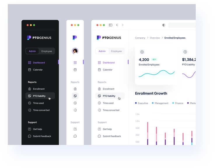
Access to all destinations at the top of a hierarchy should be made available via an app's main navigational feature. The image shown here, is a fine example of Lateral navigation which helps users to navigate through the pointers like Dashboard, calendar, enrollment, etc. Lateral navigation should be as helpful as possible, with clear and accessible links to everywhere the user may need to go without being cluttered or overwhelmed.

Applications with two or more top-level destinations can place lateral navigation through a navigation drawer, bottom navigation bar, or tabs.

Component Use For Number of Destinations
Navigation Drawer Top-level destinations 5+
Bottom Navigation Bar Top-level destinations 3-5
Tabs Any level of hierarchy 2+

Now, let’s understand the navigation drawer, bottom
navigation bar, and tabs in detail:

nav drawer

Navigation drawers:Navigation drawers are the design that slides in from the left and consists of the navigation destinations for the app. It is appropriate to use navigation drawers for five or more top-level destinations, and they can be applied to different device sizes for a consistent navigation experience.

This video is a great illustration of the navigation drawer that allows the user to swipe a finger from the activity's left edge, and then they can see the navigation drawer. The user can also find it from the home activity by using the app icon in the action bar. All top-level destinations that make use of a DrawerLayout show the drawer icon.

Access to places and app features, such as switching accounts, is made possible through the navigation drawers. They may either always be shown on the screen or be managed via a menu icon.

It is recommended to use navigation drawers for

  • Applications with at least five top-level destinations
  • Applications having a navigation hierarchy of two or more levels
  • Quick transit between unrelated places

Navigation Bar: Three to five destinations are shown in the bottom navigation bars at the bottom of a screen. In the image you can clearly see there is an icon and an optional text caption for each destination which users can see and can easily navigate.

bottom nav
mob pixal

Following the "thumb rule of design," the bottom navigation bar is centered. It relies on the fact that the majority of app users scroll and use their thumbs to browse apps. Therefore, the main screens and pages of an app should be simple for a user to reach with their thumb.

However, we would say that due to the increased size of smartphones, the mapping has altered slightly. Here, is the image that shows how the mapping has changed with the increase of screen size.

Most places were simple to access when smartphones were smaller. As our displays became larger, it became almost difficult to touch the top portion. So, how to fix this?

Placing the main menu items closer to the bottom of the screen is a better option since the top of the screen is becoming harder to access in the larger displays. What about the other destinations, which are as significant as the main menu?

responsive
However, we can suggest two options for this problem i.e.
  • Placing the search bar or any other non-primary elements at the top
  • Placing the search bar or any other non-primary elements at the top

Tabs: One of the most popular elements of mobile UIs are tabs. Navigation tabs are the most common components. User interface tabs, which are often shown on nicely positioned tab bars, allow us to transition between views and let our mobile app come to life.

These tabs, if created appropriately, will provide you with all you need to maintain control over the interface and raise usability scores.

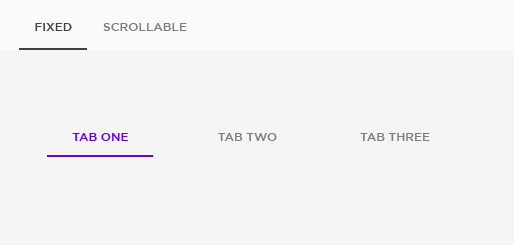
Every app has tab bars; create them clearly and succinctly and name all of the tabs whenever you can for a better user experience. See the below image how you should design a tab.

fixed scrollable

2. Forward Navigation

There are three different ways to go between screens while using forward navigation in any app:

  • Downward:

    Deep content access from a child screen to a parent screen is made possible.

  • Sequential:

    Similar to any checkout procedure, it enables browsing via a sequential or organized sequence of screens.

  • Direct:

    It enables direct navigation from one screen to another app.

Downward Navigation:Each goal is previewed on the home screen (parent) cards, which may be clicked on to access the entire goals (child) i.e. go for a walk, be active, cook dinner, etc.

Forword navigation

Sequential Navigation:Sequential navigation is well-described which you can see in the image below, which shows it in order. It depicts a customer who is interested in purchasing a chair and is moving ahead with the purchase process following the checkout procedure.

Forword navigation
Implementing Forward Navigation

Forward navigation is often integrated into the content of a screen using a range of components, in contrast to lateral navigation, which uses specialized navigation components.

Forward navigation can be applied using:

  • Content containers like cards, lists or image lists
  • Buttons for switching to a different screen
  • Search inside the app on one or more screens
  • Links inside the text or content

3. Reverse Navigation

Reverse navigation refers to backward movement between screens. It makes it easier to go through an app hierarchy or the screen history in reverse chronological order.

In reverse navigation, it's critical to put the user experience first by taking users back to their previous screen location and state to facilitate faster task resume or memory retrieval. If the previous state of the screen is not accessible due to information cleaning for privacy, it must provide a clear message. Additionally, any backward navigation must show how a child screen is related to screens higher up in the hierarchy.

Reverse Chronological Navigation: Reverse chronological navigation involves going through a user's history of recently seen screens in reverse order. Users may be moved between screens within a single app or across applications. Below image showcase reverse chronological navigation:

reversh upward

Upward Reverse Navigation: Upward navigation allows users to navigate one level upwards within a single app’s hierarchy, until they reach the app's home screen or top-level screen. For example in image 2 the up arrow in the top app bar is a form of upward reverse navigation and in image 3 shows the downward reverse navigation.

Why isUX Design
so Important?

The User experience is abbreviated as UX. The goal of UX is to provide users the greatest possible experience that reflects your company's value while still being simple to use. Determining a product's functionality and how it satisfies customer needs are all parts of creating a user experience (UX). Clear, comfortable, user-friendly UX is essential if you want to convert users into loyal customers.

Your customer will be delighted with your application's services if it has an appealing appearance, engaging content, and simple navigation. A happy customer is likely to spread the word about your app, bringing in more users and boosting your company's return on investment (ROI). The ROI (return on investment) for UX is 9,900% for every $1 invested.

The significance of the UX in mobile apps is shown by the UX statistics below:

  • If a website's content or design are unappealing, 38% of users will stop browsing it. (Source: Adobe)
  • 85 % believe that a company's mobile website ought to be just as excellent as its desktop one. (Source: Sweor)
  • If a website isn't optimized for mobile, mobile visitors are five times more likely to abandon a task. (Source: Toptal)
  • 94% of first impressions are related to design. (Source: Toptal)
  • Bad UX is the reason why 70% of online businesses fail. (Source: Truelist)

Good UX designs direct users through your app to take favorable actions. The ability to "manage" how people navigate an app is one of the nicest aspects about UX design.

Imagine opening an app and seeing 10 identical red buttons, none of which you knew what to do with. In this scenario, you'll probably choose a button at random to press or, if you're puzzled, you will just close the app. Imagine now launching an application with nine similar red buttons and one big "Start Here" green button. The big green button is significantly more likely to be pressed than any of the red ones. In a way, this is precisely how a successful UX design should be. It should direct users through the app in a manner that is both beneficial for you and engaging for the users.

UI Components for
Mobile App Navigation

1. Hamburger Menu

On mobile devices, screen space is a valuable resource, and the hamburger menu (also known as the side drawer) is one of the most well-liked mobile navigation patterns for saving the space. See the image below, you can hide the detailed navigation beyond the left side of the screen and only expose it when the user takes action using the drawer panel.

One of the most prevalent interface design patterns that is hidden by the hamburger icon is a side drawer. Numerous navigation options are also available to update the app's appearance and feel. However, they work better in casual apps like gaming apps.

hamburger

When to Use Hamburger Menu

The hamburger menu's major drawback is that it is difficult to find, hence it shouldn't be used as the primary navigation menu. For secondary navigation options, the hamburger menu can be the right choice.

Secondary navigation options are features or categories that are important to users only in certain circumstances. Being secondary, they can be put down to less prominent visual locations since they are secondary, as long as users can locate a utility easily when they need it. By hiding categories or secondary navigation behind the hamburger icon, designers avoid overwhelming users with too many options.

Also, one can use hamburger when:
  • More than 5 top-level categories
  • When the menu includes numerous levels of hierarchy
  • Pages with a lot of text (to save the screen space).
Pros of Hamburger Menu
  • A hamburger menu uses less space
  • A cleaner mobile app is made possible with hamburger menus
  • Distractions can be eliminated using the hamburger menu without compromising functionality.
  • The hamburger allows for direct navigation access
  • It simplifies the screen layouts.
Cons of Hamburger Menu
  • Possibility of lower engagement
  • Less discoverable
  • It makes features less important

2. Bottom Navigation

As the name depicts, the navigation bar is positioned at the very bottom of the app. As per standard, It often covers the whole horizontal area at the bottom of an app screen, going from left to right.

The image here is the fine example which showcases the bottom of the screen that typically has three to five navigation menu categories attached to tab bars. There should always be an icon on each tab, possibly with a brief and recognisable text caption.

When holding the smartphone with one hand, the bottom mobile navigation is the ideal choice since it has a thumb zone. As we discussed previously, the navigation bar aligns with the “thumb rule of design” It works on the principle that the majority of app users scroll and use their thumbs to browse apps. Therefore, the main screens and pages of an app should be simple for a user to reach with their thumb.

hamburger

When to Use Bottom Navigation Bar

The use of a bottom navigation bar mostly relies on which type of app it is, the app's industry specialization, and the type of information it contains. In certain situations, it could also be influenced by the tendencies and common use patterns of the app's users.

It should be used for main pages/screens that users can access from anywhere in the app. In general, there should only be three to five icons, and the home screen icon should be one of them.

It is important to remember that the bottom navigation bar does not have to be utilized for single operations like reading a message or email, listening to music, making a single purchase, etc. In fact, it should be used to organize other menus and create a list of features that can be accessed with a single click.

Also, one can use bottom navigation bar when:
  • For a menu of 3 to 5 elements (no more or fewer)
  • For quick access to distinct categories
  • For categories at the same level of the hierarchy
Pros of Bottom Navigation Bar
  • The bottom bar easily represents the current user location
  • The bottom bar is more accessible to reach with the thumb when the device is held in one hand.
  • Distractions can be eliminated using the hamburger menu without compromising functionality.
  • Clean design
  • User-friendly
Cons of Bottom Navigation Bar
  • Bottom navigation bar has limited options, we can’t keep more than 5 key options
  • Accidental touches (especially on Android)

3. Top Navigation

The top navigation bar is inherited from the desktop design. See the image here showcases the bar across the top of the screen that lists the primary navigational options like kitchen, bedroom, hallway and so on.

top nav

The reverse of bottom navigation, the top navigation bar is located at the very top of the screen. Even though it lacks the convenience of using mobile devices, bottom navigation still gives the majority of its advantages. Many users may need to switch their grips or use both hands when using bigger phones in order to access all the links in the top navigation bar.

The top navigation, like many other elements on this list, is often used in combination with other navigational methods. For example, mobile applications that use both top navigation (for primary links) and secondary navigation (for secondary links). In the image here, it clearly showcases the primary link is when you are in the bedroom category and then it directs you to the secondary link that is which bedroom products the user wants to purchase like which chairs, which bed, which sofa, etc.

When to Use Top Navigation Bar

Navigation is designed to help users get from point A to all other points on site. Top navigation can be used for secondary navigation as we have seen in the above image, how the app has used top navigation bar for scrolling kitchen, bedroom, hallway, etc. categories. If your app has lots of categories and content to access then you must go for the top navigation bar as it helps your visitors to stay and scroll on your app for longer and increase total pageviews..

Top navigation bar is used for mobile, tablet and desktop. Users can get the most out of the mobile app while using both hands thanks to the navigation bar at the top of the screen. It may instantly inform users of the important links which they are interested in scrolling.

Pros of Top Navigation Bar
  • It takes up less space
  • It supports the use of Mega Menus
  • Prominent on the page
  • Better for organized content
Cons of Top Navigation Bar
  • A limited number of tabs can be displayed horizontally
  • Content is hidden in the tab which might be overlooked by the user

4. UI Cards

Due to their extremely visual and adaptable nature, cards are a fantastic design pattern that can truly make your mobile UI sparkle. Cards are highly common in mobile app navigation and come in different forms and sizes. They are an excellent method to present numerous components like text, a link, or a picture in one location.

Cards have shown to be an excellent method to gather different types of information in one place, as content has been increasingly segmented and customized over the last few years.

ui cart

Cards can be customized to show various content in an attempt to enhance your UX design. Another benefit of cards is that they can make users aware right away when the cards can be scrolled horizontally, which enhances usability in general. Cards also have the advantage of being readily adjustable to various screen sizes, which makes them a fantastic choice for responsive applications.

When to Use UI Cards

As discussed above, the ability of the UI card designs to improve UX is thus undeniable. However, that does not imply that they are suitable in all circumstances. Here are a few things to think about before diving completely into a card UI design for your app.

Cards are more useful for exploring information than for doing searches. The main goal of creating a layout using cards is to enable users to swiftly consume substantial amounts of content and delve deeply into their interests.

When users need to evaluate several options, cards aren't the best solution (for example, when users need to compare a few products on an eCommerce page). Cards make it more difficult for users to compare since they only provide a small amount of content. For that, a list or grid view is preferable.

Everyone wants simple and fastest navigation to see their content in the best possible way. Certainly, the cards provide us the opportunity to enjoy that benefit.

Pros of Top Navigation Bar
  • Also,
  • Cards are useful since they are created based on the choices, actions, and interests of the user.
  • Cards make advantage of the surroundings and location context.
  • Cards compile the user friendly preferences which are a crucial aggregation component.
  • Cards are compatible with the system for targeted advertising.
Pros of UI Cards
  • Ideal for aggregated content
  • Easy to browse
  • Sharable
  • Versatility
  • Provide personalized user experience
Cons of UI Cards
  • Difficult to update
  • Not for all mobile apps
  • Not easy to make your design stand out

5. Tabs

One of the most popular elements of mobile UIs are tabs. They enable users to switch between views, data sets, or functional aspects of an app. When used properly, tabs increase usability by enhancing the clarity of the navigation process.

There are two types of tabs

  • Fixed Tab
  • Scrollable tab

Tabs and the navigation tab bar are often mistaken. Let’s understand the difference

The functionality of the two designs differs significantly even though they both use the tab metaphor. Items in tabs are connected to one another while items in navigation tab bar are not. In other words, users anticipate being sent to a different view that may or may not be relevant to the current view when they select an option in a bottom navigation tab bar.

Same user for tabs believes they will be in the same view but will instead receive information connected to the parent tab or the one that has been opened. User does not expect to see a totally irrelevant view with a distinct perspective.

tab

When to Use Tabs

Use tabs at higher level hierarchy. Avoid using tabs for content pagination or carousels. These use cases include viewing content rather than switching between different content groupings.

Do not use tabs with content that supports the swipe action, since swipe actions are used to switch between tabs. For example: Avoid using tabs in a map where the content is not comparable or list containing items that can be swiped away.

Fixed tabs are used with a limited number of tabs whereas scrollable tabs are used when there are many or variable number of tabs.

Also one can use tabs when:
  • If you have two or nine different categories, then you can use tabs.
  • Information must be easy to browse and highly scannable when using an app. Instead of browsing different pages, users often glance at them on the home screen. In these circumstances, adding tabs may help users find the precise information they want.
  • A page could benefit from having a more organized structure. Because the navigation structure adheres to users' expectations, using tabs may be effective and result in a positive user experience.
Pros of Tabs
  • More content in limited space
  • Universally understood
  • Good discoverability
  • Thumb friendly
  • Immediate access
Cons of Tabs
  • Limited number of tabs can be displayed horizontally
  • Hard to give third level of navigation

6. Gesture Navigation:

There are several variations of gestures. The image below includes a list of the most common.a

Tap

Tap:Briefly touch surface with fingertip

Double Tap

Double Tap:Rapidly touch surface twice with fingertip

Drag

Drag: Move fingertip over surface without losing contact with fingertip

Flick

Flick: Quickly brush surface with fingertip

Pinch: Touch surface with two fingers and bring them closer together

Spread

Spread:Touch surface with two fingers and move them apart

Press

Press:Touch surface for extended period of time

Press and tap

Press and tap:Press surface with one finger and briefly touch surface with second finger

Press and drag

Press and drag: Press surface with one finger and move second finger over surface without losing contact

Rotate

Rotate: Touch surface with two fingers and move them in a clockwise or counterclockwise direction

Users can rapidly swipe in the direction they want to go in an app or carry out a specific activity due to gesture-based navigation. Gesture-based navigation has been a common UI pattern for years, but it gained popularity among mobile app users with the release of the well-known dating app Tinder. Right swipe to select and the left to reject.

The use of gestural navigation, which involves touching and dragging objects both horizontally and vertically as well as zooming in and out, makes it easier to move between various scenes inside an app. It is quite engaging and immersive, allowing a dynamic experience.

Even the most unskilled user may easily understand this UI design pattern since the movements are often obvious and only take a little trial and error to get perfect.

When to Use Gesture Navigation

More content is accessible by users or visitors than ever before. With this increase in content, it’s easy for displays and interfaces to appear cluttered. Designers can use gestures to minimize the amount of visible components that take up space, such as buttons.

When designing a gesture based interface, it’s good practice to stick with what users need and what type of navigation they access the most. You may be innovative when necessary, but maintaining some consistency in your gestures and user interfaces makes them more comprehensible to users and improves the usefulness of your product.

There is a possibility that users will download your app on App store and Play store, both of which already have in-built gestures. You’ll need to evaluate the gestures of your product interface and choose if it is worthwhile to incorporate gestures that users will use.

Pros of Gesture Navigation
  • Less clutter
  • Easy to use
  • Seamless interaction
  • Intuitive and enjoyable
Cons of Gesture Navigation
  • Sometimes it vague and plain
  • Not for official purpose

7. Full Screen Navigation:

This navigation method utilizes the available area more effectively. Because it guides users from a general area of the product to more focused ones, it is sometimes referred to as a navigation hub.

At times, using different navigations may seem daunting. Some designers utilize visual hierarchy to prevent users from feeling overwhelmed and dedicate the full screen to the app's navigation.

The image here is a fine example of full-screen navigation, when you click on a product picture, that particular one opens up utilizing the full screen to give you a clear look of that product and once you browse the product it gives you an option of closing it (i.e. full-screen navigation).

Full Screen Navigation

It's the ideal approach to provide a number of navigation choices that make it simple and fast for users to learn the features of your product.

These patterns accomplish simplicity, enabling you to show information simply and organize massive volumes of data in a precise manner.

When to Use Full-Screen Navigation

This approach is particularly effective in websites and applications that are task- and direction-based since users often stick to only one branch of the navigation hierarchy at a time. Funneling readers from broad overview pages to detailed pages enables them to focus on their search criteria and concentrate on the content of a particular segment.

If you want your users to browse your content or a product in a larger space without distracting any other advertising and categories then you should go for full-screen navigation.

Excessive information on a 5-inch screen could confuse people as well as scare them. The key to providing your users with an excellent experience of what you have to offer is to categorize your product and in this case full-screen navigation can be implemented.

Full-Screen Navigation should be your first choice if you're creating an app to serve as a platform for knowledge/information exchange or skill development.

Pros of Full-Screen Navigation
  • Large chunks of information in a coherent manner and reveal information to user without overwhelming the user
  • It’s clean formation doesn’t distract with unnecessary page elements
  • Task-oriented approach
Cons of Full-Screen Navigation
  • You won’t be able to display various types of content
  • It is confusing if user doesn’t find direction to exit
Cons of Bottom Navigation Bar
  • Bottom navigation bar has limited options, we can’t keep more than 5 key options
  • Accidental touches (especially on Android)

8. 3D Touch

3D touch has potential to change user interface and improve user experience. Apple, a tech giant, has introduced 3D touch, which provides immediate selections from the iPhone home screen. It provides a shortcut to the navigation that displays the menu of choices for the selected item.

3D Touch

Leading the market in terms of technology, 3D touch is now present on a variety of smart devices, which gives designers more freedom to include it into the navigation of their apps. It provides a useful preview method from which users can directly access the options that they are interested in rather than opening an entire app.

The image here showcases how users can preview content with 3D Touch and do related actions before selecting whether to see the complete content. 3D Touch opens a preview of the content when users click on the app icon.

Right from the home screen, 3D Touch enables users to carry out tasks particular to an app outside of the app as we can see in the image. A list of quick actions is shown when you press down firmly on an app icon.

When to Use 3D Touch

The finest use of 3D Touch at the moment is for home screen activities. They provide you tremendously helpful shortcuts that speed up and simplify regular chores. Things that often require two, three, or even four taps may now be accessed with only one touch from the home screen.

The most common activities can be made the easiest to access with 3D Touch. Similar to keyboard shortcuts on a desktop computer, 3D Touch makes it possible for users to do routine chores more rapidly. With the use of 3D Touch, users may bypass extra steps all entirely or skip a few of them.

However, crucial functionality shouldn't be restricted to 3D Touch, much as keyboard shortcuts. Without it, users must be able to use your app regularly.

Full-Screen Navigation should be your first choice if you're creating an app to serve as a platform for knowledge/information exchange or skill development.

Pros of 3D Touch
  • Quick action on app icons
  • It is faster
  • Enhances user experience
Cons of 3D Touch
  • Expensive to design
  • Users sometimes believe that all applications support 3D touch whereas they really do not.

Great Examples of Mobile App Navigation

Amazon's

You can quickly explore the app and find the products you're searching for, which is one of the key aspects of Amazon's Navigation design.

It uses mostly all navigation design like hamburger menu, top navigation bar, reverse chronological navigation, etc.

Tinder app

Tinder app is easy to use and isn’t overwhelmed by lots of UI elements. It’s gesture based navigation become a key part of its user experience

Pinterest

The Pinterest design is highly intuitive and enhances the user experience with its UI cards navigational design.

Myntra

The simple navigation boards let new bees locate the ideal product without being overwhelmed by the number of options. Additionally, Myntra uses more than one navigation design.

Best Practices of Mobile App Navigation UX Design that Every Designers Must Follow

Consider the following best practices to ensure seamless navigation in your mobile app:

  • Always make it possible to go back
  • Make it easy on the eye
  • Onboard your users about your navigation pattern
  • Don’t make your users scroll down for too long
  • Choose the order of your navigation design wisely
  • Avoid clutter
  • Navigation should be simple yet discoverable
  • Follow the thumb rule
  • Reduce cognitive load
  • Add a search bar, don’t just add search icon
Our UI/UX Design Services
  • UI/UX mobile app design services
  • Responsive web design services
  • UI and UX consulting
  • Cross-platform experience design
  • Branding
  • Product design services
  • Visual design
  • Interactive design

Get in Touch

Are you looking for solutions and help for your Mobile App? Ace Infoway can help. Connect with our experts and get a free estimate.

form-bg-1

LET'SDISCUSS!

Make your mobile app idea a reality by getting a free consultation with us.

^